8 min read
A considerable amount of research goes into preparing our annual blog article about the hottest interior room colors. We review what paint manufacturers have identified as trends. We assess what customers are requesting for their projects. We peruse interior design resources including websites, magazines and catalogues. From these sources we compile a palette of “The Hottest Interior Room Colors” for your consideration.
This year we will be seeing a change from the popular gray and greige room colors of 2013 and 2014. Rooms will be brighter. White will be the predominate color used in homes on walls, trims and ceilings. Blues remain ever popular. Red can add energy to a room. Green will be used as a neutral to complement many of the wood finishes and fabrics offered by popular home décor retailers such as Pottery Barn, West Elm, Martha Stewart and Ikea.
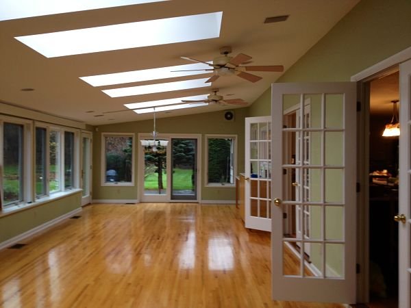
Wall color is Benjamin Moore's Guilford Green HC-116. Trim is Benjamin Moore's White Dove PM-19.
Our Picks: The Hottest Interior Room Colors for 2015
Reds
Red is “red hot”. The Pantone Color Institute, a company that creates and matches colors for graphic artists and for commercial products, chose “Marsala”, a rich red with brown/amber undertones, as its color of the year. We’ll be seeing a lot of red in 2015 in fabrics, fashion, accessories, beauty products and home furnishings.
Our picks are from Benjamin Moore:
 |
Benjamin Moore's Onondaga Clay 1204. There is a Central New York reference in the name of this paint color. “Onondaga Clay” is a warm versatile red that will work as a neutral in a room. The color can be used with either light or dark cabinetry. It has a brown undertone. |
 |
Benjamin Moore's Garrison Red HC-66. “Garrison Red” is a classic color from the company's Historical Color Collection. It can be used as either an accent or wall color. |
Whites
White has always been a “go-to” wall color for many homeowners because it reflects light and can create an illusion of space in a room. With the trend towards smaller homes, a limited color palette and white walls and trim can unify rooms and hallways. Give these white colors on our list a try.
 |
Benjamin Moore's White Dove PM-19. If you want to brighten a room, “White Dove” has a soft, subtle creamy undertone and is one of the most popular colors used by interior designers. This color has been one of our choices for the past two years and remains on our palette for 2015. |
 |
Sherwin Williams' Extra White SW 7006. Almost all paints in the white spectrum have soft undertones of color – yellow, blue, green, pink, brown, gray. Whites with gray undertones are warm and neutral. “Extra White” is one of those hues and was selected by Pottery Barn for its Spring/Summer 2015 paint palette. |
Blues
In 2012 House Beautiful magazine conducted a poll of its readers asking them about their color preferences. Most responded that their favorite interior color is blue. Blue is still going strong. There are many hues ranging from soft pastels to deep dark shades of blue, with teal and blue-gray in between. These are our favorites:
 |
Benjamin Moore's Iceberg 2122-50. “Iceberg” is a soft pastel blue that can be used in just about any room of a house. It is very neutral and looks amazing with black, brown, grays or deep shades of blue. |
 |
Benjamin Moore's Mayo Teal CW-570. When is old new? Benjamin Moore recreated “Mayo Teal” from a reclaimed baluster from a demolished late 18th or early 19th century house that once stood near the US Capitol. For lighter shades of teal that we’ve featured in past years see “Palladian Blue” HC 144 and “Wythe Blue” HC 144 from Benjamin Moore. |
 |
Benjamin Moore's Silver Mink 1586. This is a shade of blue-gray that can appear luminous on a wall. If you’re looking for a color for a bedroom, “Silver Mink” is relaxing and a great color to use with both wood stained and white painted furniture. It’s also a color to consider for a kitchen if you’re using quartz or granite counter surfaces. It complements black, gray and brown tones. |
 |
Sherwin Williams' Denim SW 6523. Pottery Barn is showing five shades of blue for 2015, “Denim” is on their list and is one of our picks. It is a deep rich saturated blue with a gray undertone that softens the effect in a room. |
Greens
Ask any artist and they will tell you that green is a difficult color to get right. This is especially true when using green on interior walls. It can look either washed out or too intense. Here are two green paint colors from Benjamin Moore, including their Color of the Year for 2015, that are virtually foolproof. Several of our customers have used these colors and the results have been remarkable.
 |
Benjamin Moore's Guilford Green HC-116. “Guilford Green” is a midtone green that has been part of Benjamin Moore’s Historic Collection for years. In 2015 it is the perfect color for almost any room of a home and works with the popular shades of teal that are featured in today’s home furnishings and accessories. It blends with hardwood flooring and augments just about any wood stained cabinet finish. |
 |
Benjamin Moore's Camoflage 2143-40. Our final pick for 2015 is a khaki green color from Benjamin Moore that is exactly what its name implies, “Camouflage.” It is very subtle and neutral. |
The Paint Manufacturers: 2015 Colors of the Year
Many major paint manufacturers have selected a “Color of the Year.” Each is offering a color that differs from choices of competitors. Here are some examples of colors they will be marketing:
Benjamin Moore: Guilford Green HC-116
Sherwin Williams: Coral Reef SW 6606
PPG Pittsburgh Paints: Blue Paisley PPG 1238-6
Related Posts
The Hottest Interior Room Colors for 2016
White will be an interior room color that you will be seeing used frequently in 2016. Why? White...
The Hottest Exterior Paint Colors for 2013
If you’re planning to paint the exterior of your home this summer to give it a fresh updated look,...
The Top 5 Home Remodeling Articles for 2015
If you missed some of our home remodeling blog articles during the year, it’s your chance to catch...