10 min read

White will be an interior room color that you will be seeing used frequently in 2016. Why? White accentuates architectural details and unifies rooms of a home when used on walls and trims. White can make a small room seem larger. It reflects light and serves as a neutral background for furnishings and wall art.
When selecting colors for our annual list of the “Hottest Interior Room Colors” we look at the best selling colors from major manufacturers for tried-and-true paint colors that will stand the test of time. We also review trends on popular home décor websites and in magazines. Then, we consider how these colors may actually look in homes with products our customers here in Central New York choose for their remodeling projects.
Below are our paint color selections as well as the 2016 “Colors of the Year” selected by paint manufacturers.
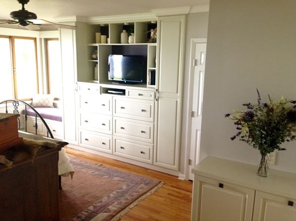
“Cloudy Gray” was used on the ceiling and “Balboa Mist” on the walls of this master bedroom. “Simply White” was used for the doors and trims. Paint colors are Benjamin Moore.
Our Picks: The Hottest Interior Room Colors for 2016
Whites
Few whites are true white. When selecting white paint colors (and other colors) it’s always important to be aware of undertones that can be yellow, beige, blue, gray, green and pink. Undertones used in white paint can complement wall colors if you are choosing a white hue for trim. Paint manufacturers will often show you on their websites how paint colors can be used together. However, the lighting in your home can affect the way a color looks in a room. It helps to buy a paint sample, paint a core board and observe the color in the area you plan to paint before you commit.
 |
Benjamin Moore's Simply White OC-117. This classic white works well with almost any color as a trim or wall color. It is virtually clear of undertones. |
 |
Benjamin Moore's White Dove PM-19. There is a soft gray undertone in this shade of white which makes it an ideal trim color if you are painting walls gray, green or blue. When used as a wall color it is a calming neutral. |
 |
Benjamin Moore's Mayonnaise OC-85. Mayonnaise has a creamy yellow undertone that will add warmth to a room. |
 |
Sherwin Williams’ Alabaster SW 7008. This white hue has a beige undertone. |
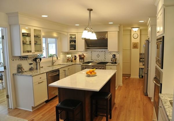
“Mayonnaise” was used on the walls of this kitchen and complements the cabinetry, which is Bishop Cabinets “Quakerstown” with “Nordic White” painted finish, and counters, which are Cambria “Torquay” on the island and “Praa Sands” on the perimeter. The brushed nickel hardware on the cabinets is from Top Knobs.
Neutrals
Neutral paint colors include off-white, gray and beige. Our neutral picks are soft and mid-tone gray and greige hues.
 |
Benjamin Moore's Gray Owl OC-52. You may have seen this color used in rooms shown in popular magazines. Many interior designers like “Gray Owl” and the color is featured on Benjamin Moore’s 2016 palette. The color complements stainless steel appliances and many quartz, granite, marble, soapstone and laminate counter surface patterns. It is frequently used with contemporary and transitional interiors. We listed this hue on our palette in 2014 as a wall color to use with “Simply White” trim. |
 |
Benjamin Moore's Silent Night 1613. This mid-tone gray is elegant and warm. Try it with “Simply White” trim. |
 |
Benjamin Moore's Cloudy Gray 2107-70. At times you will see “gray” used to describe a color that is a “greige”, a hue that appears beige with a black undertone. This is one of those colors and is a warm neutral because it also has a subtle red undertone. |
 |
Benjamin Moore's Balboa Mist 1549. This griege is very neutral and has a gray tone. |
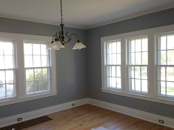
“Silent Night” was used for this dining room. It is striking with “Simply White” trim.
Blues
Blue remains one of America's most popular colors. Blue paint has undertones of green, violet, gray and black. We have selected two hues for our palette, a teal and a gray blue.
 |
Benjamin Moore's Woodlawn Blue HC-147. Teal blue will continue as a favorite color and complements popular neutral including grays, beige, tan, dark brown and classic black. This hue is less green with gray undertones. |
 |
Benjamin Moore's Bachelor Blue 1629. This gray blue is neutral and would be a good choice for a bedroom, bathroom or family room. |
Trending
Two colors that people like and find somewhat difficult to select because of undertones are green and yellow.
 |
PPG Pittsburgh Paints’ Paradise Found PPG1135-5. Green paint colors often change visually with natural and electric lighting that can make green look more yellow or intense than the chip or drab. “Paradise Found” has a blue undertone which that softens the effect. This is a stunning hue that would work in any room or on an exterior. |
 |
Benjamin Moore's “Winter Sunshine” Benjamin Moore 345 Yellow can brighten a Central New York home but yellow is tricky because of orange, peach, green, gold and brown undertones. This is a pleasant hue, a mellow yellow, with subtle balanced gold undertones. |
Paint is available in textures. Ralph Lauren Paint produces specialty finishes that include suede, polished patina and river rock textures. These textures can provide an interesting effect in a room.
Ralph Lauren Suede “Muddy Creek” SU106 was used for walls and ceiling of this kitchen remodel.
The Paint Manufacturers: 2016 “Colors of the Year”
Benjamin Moore surprised interior designers by selecting “Simply White” OC-117 as its “2016 Color of the Year”. In past years “Simply White” has been one of our choices of foolproof wall and trim colors highlighted in our blog, so the choice of Benjamin Moore’s designers was not totally surprising to us. Benjamin Moore’s paint palette for 2016 features 18 colors and includes six neutrals, five pastels and seven brighter hues.
Sherwin Williams also showcased white as its “Color of the Year”. The choice of its designers is “Alabaster” SW 7008. In addition to “Alabaster” Sherwin Williams has created a palette of 34 colors for 2016. Sherwin Williams also features 20 colors selected by designers at Pottery Barn that augment furniture, fabrics, wall art and other products sold at stores. Many of the colors shown in the Pottery Barn catalogue are white, blue and neutrals.
PPG Pittsburgh Paint is setting a trend with its Color of the Year “Paradise Found” PPG1135-5. This color is a neutral gray green with blue undertones. It is both calming and vibrant and can be paired with gray, beige or soft blues. It is a color that complements stone counter surfaces in kitchens, can be comforting when used in a bedroom or family room and is perfect for a bathroom.
Behr’s palette this year is bold and features 15 colorful hues in addition to five neutral colors.
The colors you choose for your home reflect your personal style. You can learn more about selecting colors from our free guide “How to Select Room Colors” and blog articles we’ve posted featuring our palettes for the past five years.
Related Posts
The Hottest Exterior Paint Colors for 2013
If you’re planning to paint the exterior of your home this summer to give it a fresh updated look,...
Project of the Month: Kitchen and Dining Room Remodel
The owners of a split-level ranch-style home built in 1977 wanted to remodel their kitchen and...
The Hottest Interior Room Colors for 2015
A considerable amount of research goes into preparing our annual blog article about the hottest...